

Sponsored Content
Putting a good analysis into PowerPoint can take longer than it should. You already have the numbers, but you still need to choose which charts matter, write the slides, and format something you’d actually be happy to send to a client or your team.
Julius’s AI presentation maker can turn Excel or CSV data into an editable PowerPoint. For a data-heavy presentation, though, I’d break the work into a few steps rather than ask for the finished deck right away. Check the data, work out what matters, and then give the AI a clear brief for the slides.
We’ll walk through that process using a simple quarterly marketing report. The accompanying sample workbook contains hypothetical data, not customer results. It’s deliberately small so you can follow the calculations yourself.
1. Start With the Question the Presentation Needs to Answer
For this example, let’s say you’re putting together a marketing review for your leadership team. They want to know how revenue changed last quarter and what to look into before setting the next quarter’s budget.
That gives you a more useful starting point than ‘make a presentation about marketing performance.’ You’re looking for the overall change, the channels behind it, and anything that should make the team question a proposed budget increase.
Our workbook has a Revenue tab with attributed revenue by channel for Q1 and Q2, and a Paid search spend tab with advertising costs for those same quarters. All amounts are in whole US dollars. Each revenue dollar is assigned to one channel, and we’re assuming that the attribution method stayed consistent between quarters.
There’s also a Check calculations tab with reference results. Keep that separate from the source data so you don’t accidentally count the same revenue twice.
2. Check the Workbook Before Asking for Slides
You can upload an Excel workbook to Julius and ask questions across multiple sheets. Name the tabs you want it to use rather than leaving that choice open.
I’d start with a prompt like this:
Read the workbook notes, then inspect the Revenue and Paid search spend tabs. Confirm the periods, units, and what each row represents. Flag missing values, duplicate quarter-and-channel records, or anything ambiguous. Do not change the data or make slides yet. Treat Check calculations as a reference, not additional source data.
With a real workbook, this is also where I’d check what ‘revenue’ actually means. Booked revenue, cash collected, and pipeline aren’t interchangeable. If that definition is missing, clarify it before asking the AI to draw conclusions.
The sample uses revenue attributed to each channel. That tells us how revenue was assigned in the report. It doesn’t establish how much additional revenue the channel caused.
3. Work Through the Analysis and Verify the Main Numbers
Once the inputs are clear, ask for the calculations you need:
Using the two source tabs, calculate total attributed revenue for Q1 and Q2, the percentage change, and each channel’s dollar contribution to the change. For paid search, calculate return on ad spend as attributed revenue divided by media spend. Show the formulas and source values, then compare your results with Check calculations. Do not infer missing costs or recommend a budget allocation yet.
For our hypothetical data, the revenue summary should look like this:
| Channel | Q1 revenue | Q2 revenue | Change |
|---|---|---|---|
| Organic search | $100,000 | $150,000 | +50% |
| Paid search | $150,000 | $180,000 | +20% |
| Partners | $50,000 | $30,000 | -40% |
| Total | $300,000 | $360,000 | +20% |
Total revenue increased by $60,000, or 20%. Organic search contributed a $50,000 increase, paid search added $30,000, and partners declined by $20,000. Those changes add up to the same $60,000 increase.
There’s another detail worth including. Paid search spend increased from $30,000 to $54,000, an 80% increase. Its attributed revenue only increased by 20%, so return on ad spend fell from 5.0x ($150,000 divided by $30,000) to roughly 3.3x ($180,000 divided by $54,000).
A slide that only says ‘paid search revenue grew 20%’ would leave out something important. The channel brought in more attributed revenue, but at a lower revenue-to-spend ratio.
That doesn’t tell us to cut the budget, and we don’t have enough information to say which channel is most profitable. We don’t have margins or the costs of organic search and partnerships. It does give the team a specific question to investigate before increasing paid search spend.
Before moving on, check those few calculations yourself against the source tabs. Asking the AI to check its own answer is useful, but I’d still independently verify the numbers that will drive the recommendation.
4. Turn the Findings Into a Presentation Brief
Now you have enough to ask for the deck. Include the audience, the meeting length, the main findings, and the limits of the data in the prompt.
Julius can create charts from your data. For this example, I’d ask for a grouped bar chart comparing revenue by channel across the two quarters, plus a small table showing paid search spend and return on ad spend. Label the currency and periods clearly.
Then give it a presentation brief:
Create a six-slide PowerPoint for a 10-minute marketing review with our leadership team. Use only the verified results from this analysis. Cover the overall result, revenue by channel, paid search spend and return on ad spend, questions raised by the partner decline, data limitations, and next steps. Use takeaway titles and keep the slides concise. Include the source tab and reporting period below each chart. Do not invent causes, benchmarks, forecasts, or missing costs. Make the presentation editable.
For the paid search slide, a useful title would be ‘Paid search revenue grew 20%, while return on ad spend fell from 5.0x to 3.3x.’ That gives the audience the point of the slide without making them work it out from the chart.
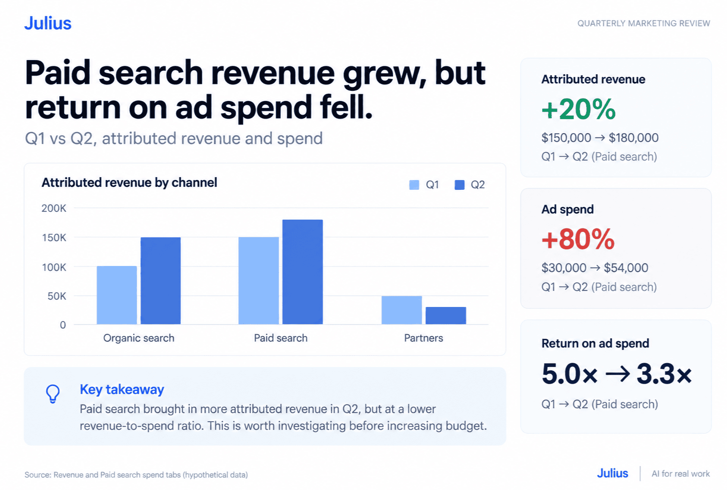
For partners, you can show the decline and suggest reviewing the pipeline or account-level data. You can’t say why revenue fell from this workbook alone. Keep the proposed investigation separate from the finding.
I’d also be specific about design. Ask for your brand colors, readable labels, and a consistent layout. Julius supports follow-up requests to revise content, visuals, structure, and branding, so you can make those changes after reviewing the first draft.
5. Open the PowerPoint and Review What You Will Actually Present
Julius supports PowerPoint export, so download the deck and open it in PowerPoint before sending it around. Review the exported file rather than relying only on the preview.
Check that the totals still match, the chart labels are readable, and the slide titles say what the data supports. Make sure the source notes and qualifications haven’t disappeared during revisions. Try editing the text and inspect how the charts were exported, especially if someone else will need to update them later.
If something needs work, ask for the specific change:
Revise the paid search slide so the 20% revenue increase and 80% spend increase are both easy to see. Keep the 5.0x and 3.3x return-on-ad-spend figures. Remove any claim that profitability improved, since we do not have margin data. Leave the other verified numbers unchanged.
Then check the revised file again. It’s a small step, but it’s worth doing before the deck goes to somebody who wasn’t part of the analysis.
This is a useful place to start with AI presentations: one report, a clear question, and a handful of numbers you can verify. You can try the workflow with Julius’s AI presentation maker using the sample workbook or a report you’re already working on. Give it the context you’d give a colleague, review the calculations, and then use the deck as a draft you can refine.


