The projects that actually get people hired do something different. They start with a business problem and finish with a recommendation, and they show every stage in between. Showing every stage, from raw data to a deployed application, is the thing a resume cannot prove and a notebook cannot fake.
To keep it concrete, we’ll use one real project the whole way through: the DoorDash Delivery Duration Prediction data project. It’s a free project, so you can follow along and build this yourself.
We’ll work through it inside StrataScratch’s built-in notebook environment, an integrated Marimo notebook you can open by clicking “Start Solving” on the project page, so there’s nothing to install before you start.
So here’s what we’ll do. We’ll take that one project and run it through the nine stages of a real data science project: framing the business problem, pulling the data with SQL, cleaning it in Python, exploring it, engineering features, building and evaluating models, and finally deploying the result as an API and a dashboard that ends with a recommendation.
Each stage is a chapter of the same story, and each one is something a hiring manager can see for themselves. By the end, you’ll have a template you can drop almost any project into.
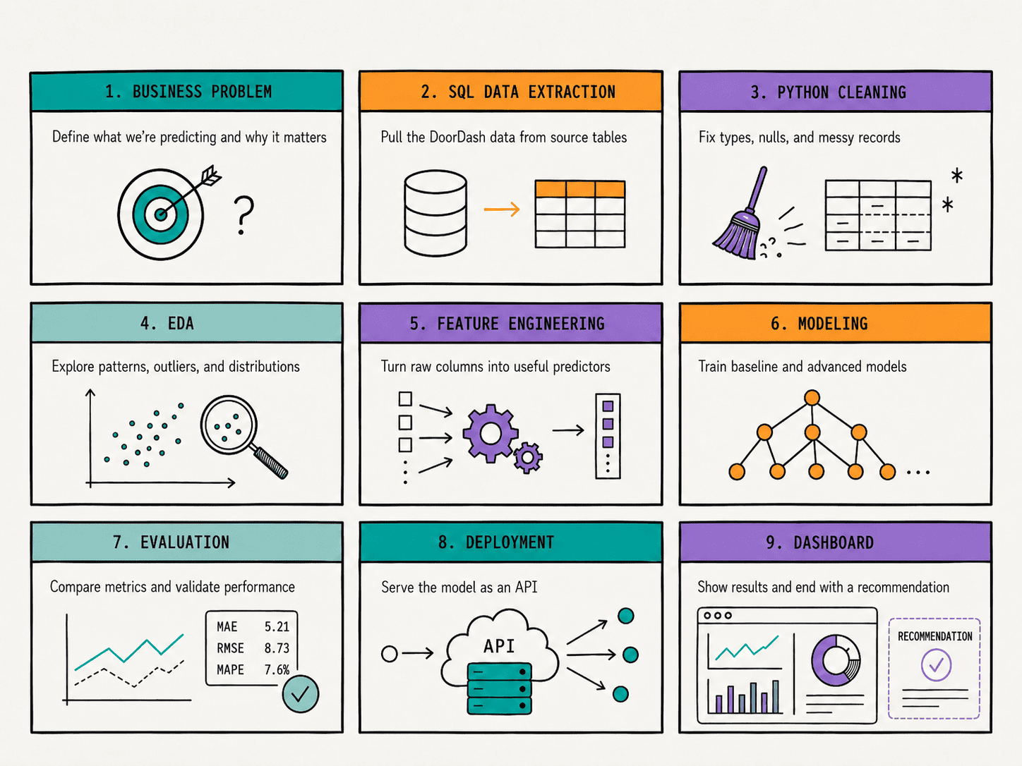
# Starting With a Business Problem
Before any code, decide what you’re actually solving.
The DoorDash project gives us a clean business question: given an order, how long will delivery take? That framing matters. It’s about what the business cares about, not the algorithm.
This is the first place most portfolios go wrong.
A project titled “Delivery Time Prediction” tells a hiring manager what you did for the company. A project titled “XGBoost Regression Demo” tells them you followed a tutorial.
Frame the problem around the outcome, and pick something with real stakes: churn, forecasting, fraud, or, in our case, operational efficiency.
# Extracting the Data With SQL
The DoorDash project hands us a CSV, historical_data.csv:
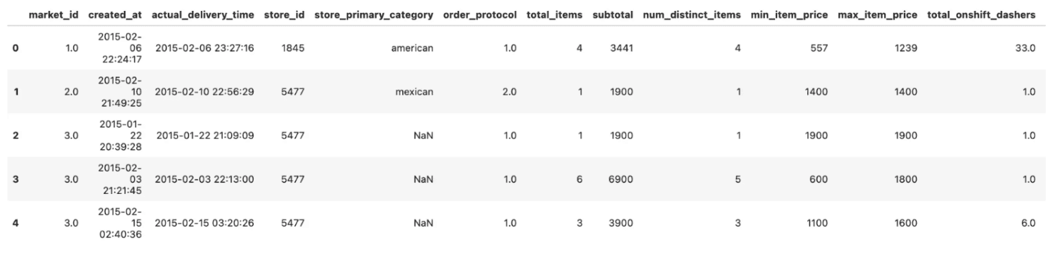
But that is not where data lives in the real world. In a company, this dataset would come out of a database, and you’d be the one writing the SQL to build it.
We simulate this by using the integrated notebook mentioned earlier, as the dataset is already imported (as df). We directly query it with SQL. (If it were an actual database, you’d query it with FROM historical_data.)
SELECT
    market_id,
    created_at,
    actual_delivery_time,
    store_id,
    store_primary_category,
    order_protocol,
    total_items,
    subtotal,
    total_onshift_dashers,
    total_busy_dashers,
    total_outstanding_orders
FROM df
WHERE actual_delivery_time IS NOT NULL
  AND actual_delivery_time > created_at;
Outputs:
| market_id | created_at | actual_delivery_time | … | total_outstanding_orders |
|---|---|---|---|---|
| 1 | 2015-02-06 22:24:17 | 2015-02-06 23:27:16 | … | 21 |
| 2 | 2015-02-10 21:49:25 | 2015-02-10 22:56:29 | … | 2 |
| 3 | 2015-01-22 20:39:28 | 2015-01-22 21:09:09 | … | 0 |
| 3 | 2015-02-03 21:21:45 | 2015-02-03 22:13:00 | … | 2 |
| 3 | 2015-02-15 02:40:36 | 2015-02-15 03:20:26 | … | 9 |
| … | … | … | … | … |
| 1 | 2015-02-08 19:24:33 | 2015-02-08 20:01:41 | … | 23 |
That is worth showing in your portfolio.
Instead of quietly loading a file, describe the query that would produce your dataset: the joins across order, dasher, and store tables, the WHERE filters that drop bad rows, and the GROUP BY clauses that do the heavy filtering and joining in SQL — and pull an analysis-ready table into Python, not a raw dump.
# Cleaning the Data in Python
Now we bring the data into Python. This is the unglamorous stage that is 60 to 80 percent of real data science work, and skipping it is one of the clearest signals of inexperience.
For the DoorDash data, cleaning means computing our target (actual delivery duration is the delivery timestamp minus the order creation timestamp), fixing types, and handling missing and impossible values.
We use pandas for this, which is the right default at portfolio scale.
df["created_at"] = pd.to_datetime(df["created_at"])
df["actual_delivery_time"] = pd.to_datetime(df["actual_delivery_time"])

# Our target: how long the delivery actually took, in seconds
df["delivery_duration_seconds"] = (
    df["actual_delivery_time"] - df["created_at"]
).dt.total_seconds()

# Drop missing and impossible values
# A real delivery is usually between 6 minutes and a few hours
df2 = df[df["delivery_duration_seconds"].between(60, 3 * 3600)]

df3 = df2.dropna(subset=["delivery_duration_seconds"])

df3
Outputs:
| market_id | created_at | actual_delivery_time | delivery_duration_seconds |
|---|---|---|---|
| 1 | 2015-02-06 22:24:17 | 2015-02-06 23:27:16 | 3779.0 |
| 2 | 2015-02-10 21:49:25 | 2015-02-10 22:56:29 | 4024.0 |
| 3 | 2015-01-22 20:39:28 | 2015-01-22 21:09:09 | 1781.0 |
| 3 | 2015-02-03 21:21:45 | 2015-02-03 22:13:00 | 3075.0 |
| … | … | … | … |
| 3 | 2015-02-15 02:40:36 | 2015-02-15 03:20:26 | 2390.0 |
If your dataset were large enough to strain memory, Polars would be the faster, multi-core alternative, but for a project like this, pandas is plenty.
import polars as pl

df = pl.read_csv(
    "historical_data.csv",
    null_values=["NA"],
    try_parse_dates=True
)

df = df.with_columns(
    (pl.col("actual_delivery_time") - pl.col("created_at"))
    .dt.total_seconds()
    .alias("delivery_duration_seconds")
).filter(pl.col("delivery_duration_seconds") > 0)
# Exploring the Data
Exploratory data analysis (EDA) is where we find the story we’ll eventually tell.
The workflow is simple and repeatable: summarize the data with methods like df.info() and df.describe(), then visualize distributions and relationships, then note what’s surprising.
df3["delivery_minutes"] = df3["delivery_duration_seconds"] / 60
df3["delivery_minutes"].describe()
Note that df3 is the cleaned dataset from the previous pandas code.
Outputs:
| statistic | value |
|---|---|
| count | 197283.0 |
| mean | 47.5 |
| std | 18.0 |
| min | 1.7 |
| 25% | 35.1 |
| 50% | 44.3 |
| 75% | 56.3 |
| max | 179.8 |
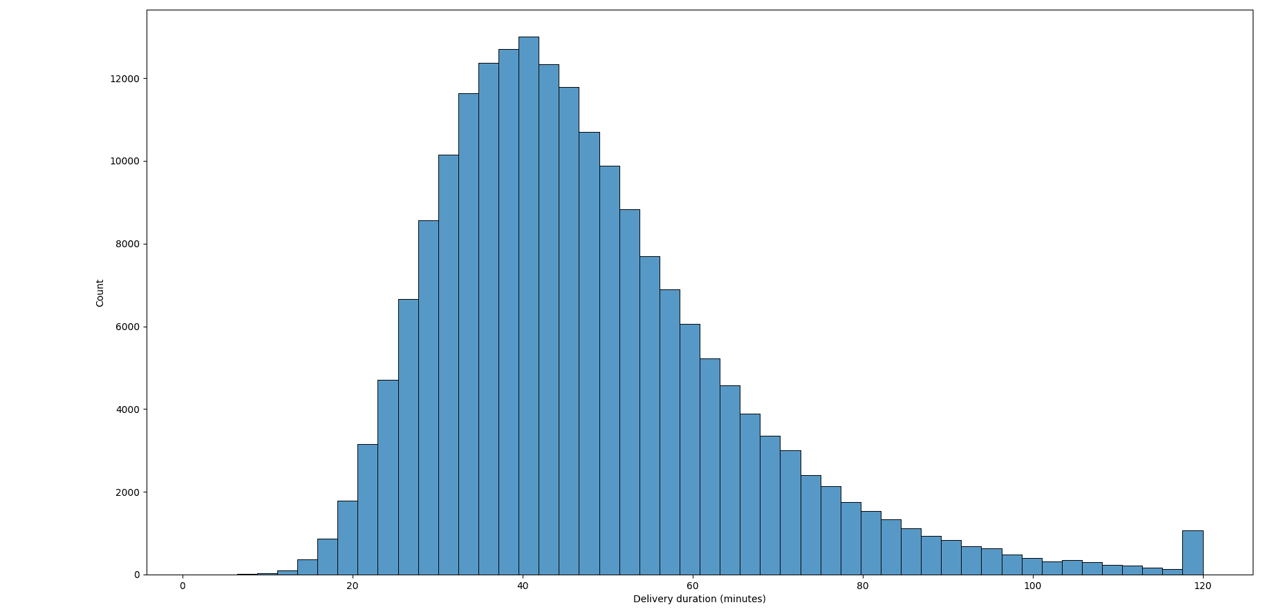
For delivery duration, we’d look at how it varies by market, by hour of day, and by how busy the dashers are. We use Matplotlib and Seaborn for histograms, boxplots, and scatter plots.
import matplotlib.pyplot as plt
import seaborn as sns

# Distribution of delivery time
sns.histplot(df3["delivery_minutes"].clip(upper=120), bins=50)

plt.xlabel("Delivery duration (minutes)")
Outputs:
# how it varies across markets
df3.groupby("market_id")["delivery_minutes"].median().sort_values()
Outputs:
| market_id | value |
|---|---|
| 1 | 46.9 |
| 2 | 43.3 |
| 5 | 43.4 |
| 6 | 43.6 |
| 3 | 44.1 |
| 4 | 44.4 |
The goal is to understand what drives the thing you’re predicting.
# Engineering the Features
Raw columns rarely make the best predictors. Feature engineering is where domain thinking turns into model inputs, and it’s often what separates a good project from a forgettable one.
In the DoorDash project, this is the most interesting stage. We build a busy_dashers_ratio to capture how stretched the fleet is, and an estimated_non_prep_duration that combines driving and order-placement time.
import numpy as np

df3["busy_dashers_ratio"] = (
    df3["total_busy_dashers"]
    / df3["total_onshift_dashers"]
)

df3["estimated_non_prep_duration"] = (
    df3["estimated_store_to_consumer_driving_duration"]
    + df3["estimated_order_place_duration"]
)

# The busy ratio can divide by zero
df3 = df3.replace([np.inf, -np.inf], np.nan)

df3[
    [
        "busy_dashers_ratio",
        "estimated_non_prep_duration",
    ]
].head()
| index | busy_dashers_ratio | estimated_non_prep_duration |
|---|---|---|
| 0 | 0.424242 | 1307.0 |
| 1 | 2.000000 | 1136.0 |
| 2 | 0.000000 | 1136.0 |
| 3 | 1.000000 | 735.0 |
| 4 | 1.000000 | 1096.0 |
We turn categorical columns like market and order protocol into dummy variables. Then we deal with features that carry the same information, using a correlation heatmap and Variance Inflation Factor (VIF) to drop the redundant ones.
from sklearn.compose import ColumnTransformer
from sklearn.preprocessing import OneHotEncoder, StandardScaler
from sklearn.pipeline import Pipeline

numeric = [
    "busy_dashers_ratio",
    "estimated_non_prep_duration",
    "total_items",
    "subtotal",
    "num_distinct_items",
    "min_item_price",
    "max_item_price",
    "total_onshift_dashers",
    "total_outstanding_orders",
]

categorical = ["market_id", "order_protocol"]

preprocess = ColumnTransformer([
    ("num", StandardScaler(), numeric),
    ("cat", OneHotEncoder(handle_unknown="ignore"), categorical),
])

# 11 raw columns become 22 model-ready features after encoding
preprocess.fit_transform(df3[numeric + categorical].dropna()).shape
Output:
Wrap all of this in a scikit-learn pipeline so the same steps run identically on training and new data, which quietly prevents data leakage.
# Building the Model
Resist the urge to jump straight to a fancy model.
Start with a baseline, even a naive one that predicts the average delivery time. If your real model can’t beat that, something is wrong, and you want to know early.
From there, we try progressively stronger models: linear models like Ridge, then tree-based models, and gradient boosting with XGBoost.
from sklearn.model_selection import train_test_split
from sklearn.dummy import DummyRegressor
from sklearn.linear_model import Ridge
from sklearn.metrics import mean_squared_error
from xgboost import XGBRegressor

data = df3[numeric + categorical + ["delivery_duration_seconds"]].dropna()

X = data[numeric + categorical]
y = data["delivery_duration_seconds"]

X_train, X_test, y_train, y_test = train_test_split(
    X,
    y,
    test_size=0.2,
    random_state=42
)

models = {
    "Baseline (mean)": DummyRegressor(strategy="mean"),
    "Ridge": Ridge(),
    "XGBoost": XGBRegressor(
        n_estimators=600,
        learning_rate=0.05,
        max_depth=7,
        subsample=0.8,
        colsample_bytree=0.8,
        random_state=42
    ),
}

for name, model in models.items():
    pipe = Pipeline([("pre", preprocess), ("model", model)])
    pipe.fit(X_train, y_train)

    rmse = mean_squared_error(y_test, pipe.predict(X_test)) ** 0.5

    print(f"{name}: RMSE = {rmse:.0f} sec")
Output:
| model | RMSE |
|---|---|
| Baseline (mean) | 1074 sec |
| Ridge | 927 sec |
| XGBoost | 875 sec |
Tree-based models usually perform best on tabular business data like this. In your writeup, explain why you chose what you chose.
That reasoning is what a hiring manager reads to see whether you understand the tools or just imported them.
# Evaluating Honestly
A single accuracy number proves nothing. For a regression problem like delivery duration, we report an error metric such as root mean squared error (RMSE) and compare every model against our baseline and against each other.
The bigger point is validating honestly. Use cross-validation instead of trusting one lucky train-test split, and never tune your model against the test set, because the moment you do, your reported score becomes optimistic fiction.
from sklearn.model_selection import cross_val_score

pipe = Pipeline([("pre", preprocess), ("model", models["XGBoost"])])

scores = cross_val_score(
    pipe,
    X,
    y,
    cv=5,
    scoring="neg_root_mean_squared_error"
)

print("Fold RMSEs:", (-scores).round().astype(int))
print(f"CV RMSE: {-scores.mean():.0f} sec (+/- {scores.std():.0f})")
Output:
| metric | value |
|---|---|
| Fold RMSEs | [900, 886, 867, 878, 882] |
| CV RMSE | 883 sec ±11 sec |
For classification problems, report precision, recall, and F1 alongside accuracy, not accuracy alone.
# Deploying the Model
Here is where most portfolios simply stop, which is exactly why going further makes yours stand out. Wrapping the model in an API is what lets anyone actually use it.
We serialize the trained model with joblib, then wrap it in a small service using FastAPI, which gives us request validation and automatic docs with almost no effort.
import joblib

pipe.fit(X_train, y_train)
joblib.dump(pipe, "delivery_model.joblib")

# api.py
from fastapi import FastAPI
from pydantic import BaseModel
import joblib
import pandas as pd

app = FastAPI()
model = joblib.load("delivery_model.joblib")


class Order(BaseModel):
    busy_dashers_ratio: float
    estimated_non_prep_duration: float
    total_items: int
    subtotal: float
    num_distinct_items: int
    min_item_price: float
    max_item_price: float
    total_onshift_dashers: float
    total_outstanding_orders: float
    market_id: int
    order_protocol: int


@app.post("/predict")
def predict(order: Order):
    row = pd.DataFrame([order.model_dump()])
    seconds = float(model.predict(row)[0])
    return {"predicted_delivery_seconds": round(seconds)}
A POST to /predict now returns something like {"predicted_delivery_seconds": 2472}. We package everything in a Docker container and deploy it somewhere public, like a free cloud tier. Now anyone can send an order and get a predicted delivery time back.
# Building a Dashboard
The final stage closes the loop back to stage one. Not everyone reviewing your work will call your API, so give them something to click. We build a small dashboard with Streamlit, the fastest way to turn a Python script into an interactive app.
For our project, the dashboard lets someone enter order details and see the predicted delivery time, and explore which factors push it up or down.
import streamlit as st
import joblib
import pandas as pd

model = joblib.load("delivery_model.joblib")

st.title("Delivery Duration Predictor")

order = {
    "busy_dashers_ratio": st.slider(
        "Busy dashers ratio",
        0.0,
        2.0,
        0.5
    ),
    "estimated_non_prep_duration": st.number_input(
        "Non-prep duration (sec)",
        value=900
    ),
    "total_items": st.number_input(
        "Total items",
        value=4,
        step=1
    ),
    "subtotal": st.number_input(
        "Subtotal (cents)",
        value=3441
    ),
    "num_distinct_items": st.number_input(
        "Distinct items",
        value=4,
        step=1
    ),
    "min_item_price": st.number_input(
        "Min item price",
        value=557
    ),
    "max_item_price": st.number_input(
        "Max item price",
        value=1239
    ),
    "total_onshift_dashers": st.number_input(
        "On-shift dashers",
        value=33
    ),
    "total_outstanding_orders": st.number_input(
        "Outstanding orders",
        value=21
    ),
    "market_id": st.selectbox(
        "Market",
        [1, 2, 3, 4, 5, 6]
    ),
    "order_protocol": st.selectbox(
        "Order protocol",
        [1, 2, 3, 4, 5, 6, 7]
    ),
}

if st.button("Predict"):
    seconds = float(
        model.predict(
            pd.DataFrame([order])
        )[0]
    )

    st.metric(
        "Predicted delivery time",
        f"{seconds / 60:.1f} min"
    )
Then we end where good data science projects always end: with a recommendation. If a high busy_dashers_ratio is the biggest driver of long deliveries, the business action is to adjust staffing during peak load. End with the business action, not just the prediction.
# Conclusion
The lifecycle is the differentiator. Anyone can train a model, but very few candidates carry a problem all the way from a SQL query to a deployed app with a clear recommendation at the end. That end-to-end story is what a portfolio is for, and it’s what a resume can never show on its own.
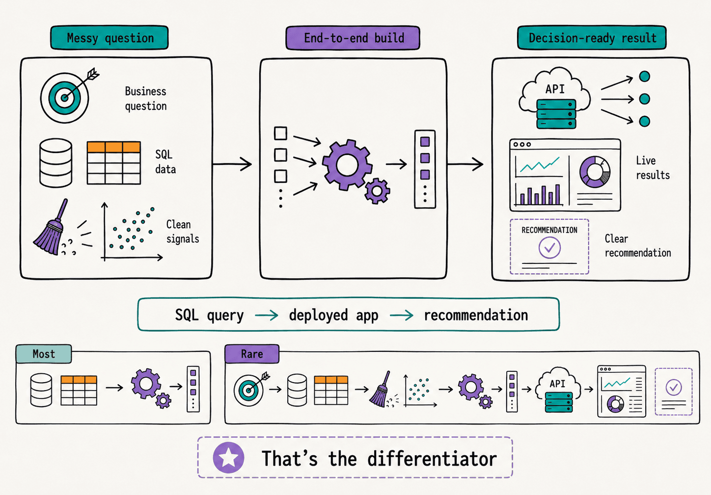
It helps to see what each half of that story proves. The early stages — framing the problem, writing the SQL, cleaning and exploring the data — show that you can turn a messy business question into something a model can actually learn from. The later stages — evaluating honestly, deploying, and building a dashboard — show that you can take a model out of a notebook and put it in front of someone who has to make a decision.
Most candidates can do one half. The ones who do both are rare, and that is exactly the gap you’re closing. The through-line that ties it together is the business framing from stage one: every stage should point back at the question you started with and forward to the recommendation you end on.
You don’t have to invent a project to practice this. The DoorDash project we used here is one of many real company take-homes in StrataScratch’s data projects, alongside problems from Meta, Capital One, Google, and others.
Pick one, run it through all nine stages, and write it up honestly, including the parts that didn’t work. That single finished project will do more for your job search than five more notebooks that stop at the model.
Nate Rosidi is a data scientist and in product strategy. He’s also an adjunct professor teaching analytics, and is the founder of StrataScratch, a platform helping data scientists prepare for their interviews with real interview questions from top companies. Nate writes on the latest trends in the career market, gives interview advice, shares data science projects, and covers everything SQL.