

# Moving Beyond Analysis By Hand
Every analyst has done this by hand. A CSV lands in your inbox, someone asks “so how did we do,” and you spend an afternoon cleaning columns, building a few charts, and typing up what they mean.
We can automate most of that. In this walkthrough, we build a small pipeline in Python that takes a raw sales CSV, cleans it, runs the numbers, draws the charts, and asks an AI to draft the insights. The AI here is Claude Opus 4.8. The model writes the first draft of the narrative in seconds. We still decide what is true.
Before any of that, the report needs a question. Ours is: how much revenue did we keep over these five weeks, and where did the rest go? Every step below answers a piece of it. Cleaning decides which rows count as money. The aggregates say where and when we lost it. The AI step turns those numbers into a summary an executive will read.
All the code is below so you can reproduce it, and the steps are the same for almost any dataset:
CSV → clean → explore → chart → AI insights → recommendations → report
# The Data
We use the product_sales.csv file, which contains 45 transaction rows. It is a dataset used in this interview question. Keep in mind that in this article we are not solving the original problem. Each row is one payment event: a purchase or a refund, with a country, a date, an amount, and a status.
Here is the raw table preview.
| transaction_id | product_id | country | transaction_date | amount | status | type | original_transaction_id |
|---|---|---|---|---|---|---|---|
| TXN-10001 | PROD-2891 | US | 2025-04-15 | 449.99 | completed | purchase | |
| TXN-10002 | PROD-2891 | US | 2025-04-15 | 449.99 | completed | purchase | |
| TXN-10003 | PROD-2891 | CA | 2025-04-15 | 449.99 | completed | purchase | |
| TXN-10004 | PROD-2891 | US | 2025-04-17 | 449.99 | completed | purchase | |
| … | … | … | … | … | … | … | … |
| TXN-10045 | PROD-2891 | US | 2025-05-11 | -449.99 | completed | refund | TXN-10044 |
Two things already stand out. Refunds are stored as negative amounts, and not every row is a completed sale. Both matter for the numbers we report.
We load it with Pandas:
import pandas as pd

df = pd.read_csv("product_sales.csv")
# Cleaning the Data
The cleaning step decides whether the totals are right. Three rows are pending or failed, so they are not money yet. We fix the types and keep only completed transactions:
df["transaction_date"] = pd.to_datetime(df["transaction_date"])
df["amount"] = pd.to_numeric(df["amount"], errors="coerce")

# Pending and failed transactions are not revenue yet.
settled = df[df["status"] == "completed"].copy()
settled["is_refund"] = settled["type"].eq("refund")
That drops 3 of 45 rows and leaves 42 completed transactions. If we had reported straight off the raw file, we would have counted a failed payment as a sale.
# Exploratory Analysis
The first half of the question: how much did we keep? Separate purchases from refunds and the headline numbers fall out. Refunds are already negative, so net revenue is just the sum of the amount column.
gross = settled.loc[~settled["is_refund"], "amount"].sum()
refunds = settled.loc[settled["is_refund"], "amount"].sum()   # negative
net = settled["amount"].sum()
refund_rate = -refunds / gross

print(f"gross   {gross:,.0f}")
print(f"refunds {refunds:,.0f}")
print(f"net     {net:,.0f}")
print(f"refund rate (value) {refund_rate:.0%}")
Output:
gross   12,975
refunds -4,875
net     8,100
refund rate (value) 38%
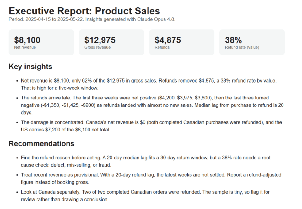
That is the whole story in four lines. We sold about $13,000 and gave back $4,875, so net revenue is $8,100. A 38% refund rate is high, and it is the kind of number that never shows up if you only sum positive amounts.
That gives the total. The second half of the question is where the money went, so we cut the data two ways. By country, to see which markets carry the net figure:
by_country = (settled.groupby("country")["amount"]
             .agg(net_revenue="sum", transactions="count")
             .sort_values("net_revenue", ascending=False))
print(by_country)
| country | net_revenue | transactions |
|---|---|---|
| US | 7199.84 | 38 |
| GB | 449.99 | 1 |
| MX | 449.99 | 1 |
| CA | 0.00 | 2 |
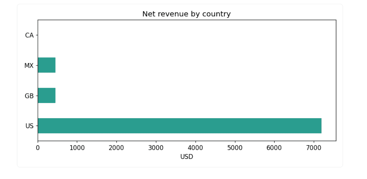
Canada is the surprise. Two completed orders, both refunded, so its net revenue is exactly zero.
Then by week, splitting purchases from refunds:
settled["week"] = settled["transaction_date"].dt.to_period("W").dt.start_time
weekly = settled.pivot_table(index="week", columns="is_refund",
                             values="amount", aggfunc="sum").fillna(0)
weekly.columns = ["purchases", "refunds"]
weekly["net"] = weekly.sum(axis=1)
print(weekly)
| week | purchases | refunds | net |
|---|---|---|---|
| 2025-04-14 | 4649.89 | -449.99 | 4199.90 |
| 2025-04-21 | 4274.90 | -299.99 | 3974.91 |
| 2025-04-28 | 3599.92 | 0.00 | 3599.92 |
| 2025-05-05 | 449.99 | -1799.96 | -1349.97 |
| 2025-05-12 | 0.00 | -1424.96 | -1424.96 |
| 2025-05-19 | 0.00 | -899.98 | -899.98 |
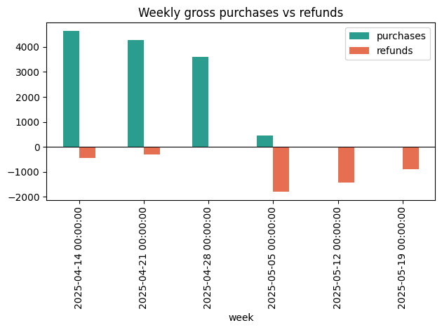
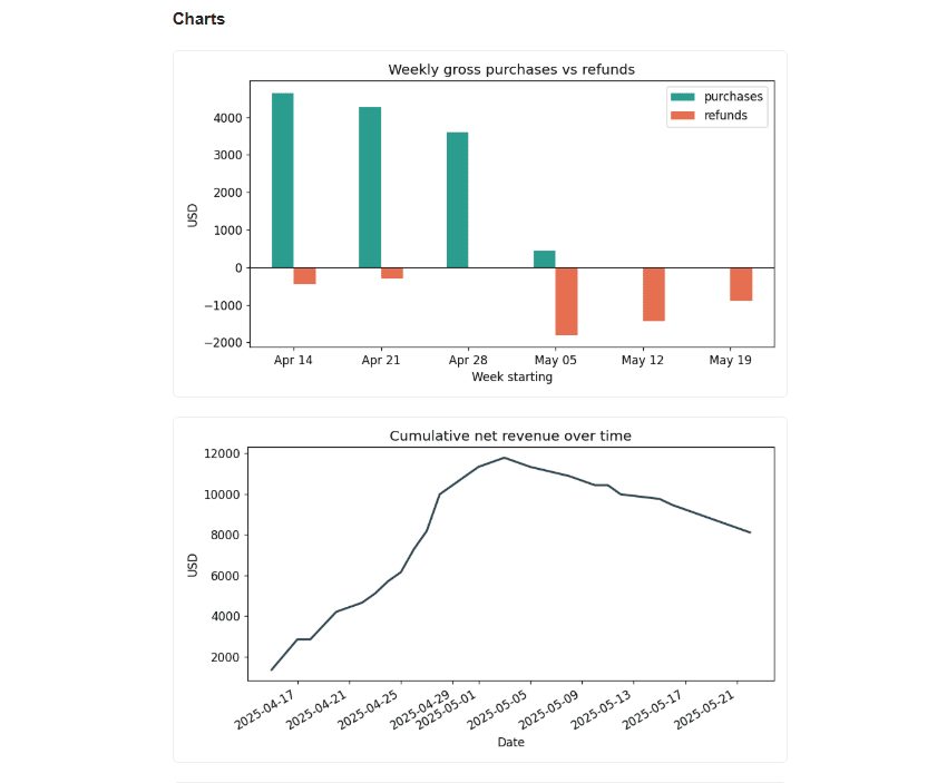
The first three weeks are net positive. The last three are net negative. Purchases stop in early May while refunds keep coming.
One more number explains the gap. Using original_transaction_id, we measure how long after a purchase each refund arrives.
purch_dates = (settled.loc[~settled["is_refund"], ["transaction_id", "transaction_date"]]
               .set_index("transaction_id")["transaction_date"])
ref = settled[settled["is_refund"]].copy()
ref["lag_days"] = (ref["transaction_date"]
                   - ref["original_transaction_id"].map(purch_dates)).dt.days
print(ref["lag_days"].median())    # 20.0
The median refund lands 20 days after the sale. April’s revenue is still being refunded in May.
# Building the Charts
We draw three charts with Matplotlib and save them as PNG files.
import matplotlib.pyplot as plt

weekly[["purchases", "refunds"]].plot(kind="bar", color=["#2a9d8f", "#e76f51"])
plt.axhline(0, color="black", linewidth=0.8)
plt.title("Weekly gross purchases vs refunds")
plt.tight_layout(); plt.savefig("chart_weekly.png")
The weekly chart makes the pattern obvious: tall green bars in April, then the refund bars take over in May.
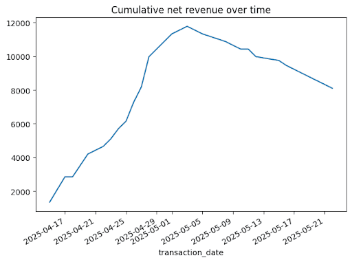
settled.groupby("transaction_date")["amount"].sum().sort_index().cumsum().plot()
plt.title("Cumulative net revenue over time")
plt.tight_layout(); plt.savefig("chart_cumulative.png")
by_country["net_revenue"].plot(kind="barh", color="#2a9d8f")
plt.title("Net revenue by country")
plt.tight_layout(); plt.savefig("chart_country.png")
# Generating AI Insights
Now we hand the numbers to the model. We build a short text summary of everything we found and print a prompt. You paste that prompt into Claude and paste the reply back into the notebook.
weekly_net = {d.date().isoformat(): round(v) for d, v in weekly["net"].items()}

summary = f"""Product sales, {settled['transaction_date'].min().date()} to {settled['transaction_date'].max().date()}.
Gross: ${gross:,.0f}  Refunds: ${-refunds:,.0f}  Net: ${net:,.0f}
Refund rate by value: {refund_rate:.0%}
Net revenue by country: {by_country['net_revenue'].round(0).to_dict()}
Weekly net: {weekly_net}
Median days from purchase to refund: 20"""

prompt = (
    "You are a data analyst writing for executives. "
    "Based on this summary, write 3 insights and 3 business "
    "recommendations. Be specific and cautious about small sample size.nn"
    + summary
)

print(prompt)
Output:
You are a data analyst writing for executives. Based on this summary, write 3 insights and 3 business recommendations. Be specific and cautious about small sample size.

Product sales, 2025-04-15 to 2025-05-22.
    Gross: $12,975  Refunds: $4,875  Net: $8,100
    Refund rate by value: 38%
    Net revenue by country: {'US': 7200.0, 'GB': 450.0, 'MX': 450.0, 'CA': 0.0}
    Weekly net: {'2025-04-14': 4200, '2025-04-21': 3975, '2025-04-28': 3600, '2025-05-05': -1350, '2025-05-12': -1425, '2025-05-19': -900}
    Median days from purchase to refund: 20
The model only sees the summary numbers. It reasons over clean aggregates, and no row-level data leaves your machine. Here is what Claude Opus 4.8 returned:
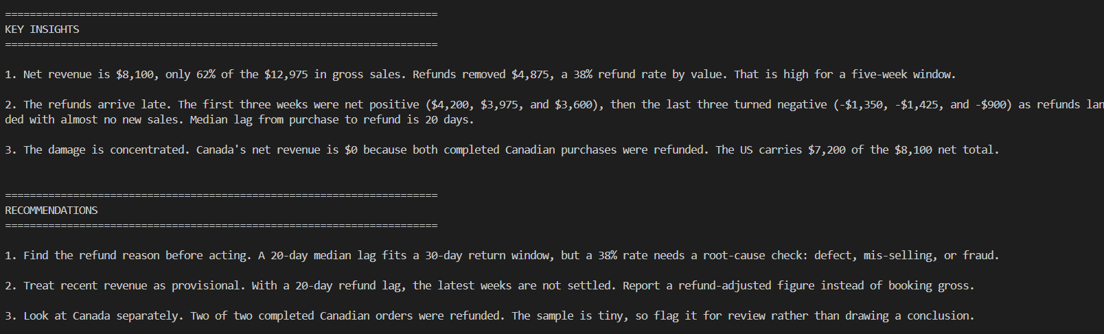
This is where a human has to stay in the loop. The model read the summary well, but it does not know that this is one product across five weeks and 42 rows. The caution about sample size is right, and we would not take any of these numbers to a board meeting without more history.
# Assembling the Executive Report
The last step assembles a self-contained report.html file with the headline metrics as cards, the three charts, and the AI text. The full builder is here.
Here is a snapshot of the report:
If you want to see the full report, download this HTML file and open it in your browser.
# Conclusion
The pipeline is short: clean the data, compute a few honest aggregates, draw three charts, and let the model draft the narrative. The cleaning step and the aggregates decide whether the report is right. The AI saves the hour you would spend writing it up.
Claude Opus 4.8 wrote clear, cautious insights from the summary, and it correctly flagged the small sample. It cannot verify the data or know the business context, so the recommendations are a first draft we edit. Run the companion script on your own CSV, change the column names, and you have a reporting tool you can point at the next file that lands in your inbox.
Nate Rosidi is a data scientist and in product strategy. He’s also an adjunct professor teaching analytics, and is the founder of StrataScratch, a platform helping data scientists prepare for their interviews with real interview questions from top companies. Nate writes on the latest trends in the career market, gives interview advice, shares data science projects, and covers everything SQL.


